Entry tags:
An introduction to DW layout CSS
Starting caveat - while I used custom layouts on LJ, and occasionally tweaked some, I never wrote any CSS overrides from scratch, mostly because I remember when S2 went live and I went 'LAYERS? A PROGRAMMING LANGUAGE? WHAT IS THIS SHIT I'M NEVER MAKING MY OWN LAYOUTS AGAIN'. So while I can answer a lot of questions about how DW does things, I don't know the answer to 'what's the equivalent of this LJ element in DW?'. I also do not know the answer to 'I broke my imported core1 layout, how do I fix it.' I'm also assuming you know CSS and HTML, but not necessarily any other programming language.
Structurally, DW layouts are very different from LJ layouts because of one major thing: core2. core2 has a whole pile of functions that define how parts of the page print out, and they're very well-written, so most of the layouts use core2's functions instead of defining their own, while a lot of LJ layouts defined their own. This means most DW layouts have the same order for how elements print. DW layouts are also ALL DIVS ALL THE TIME, because it's easier to stretch and mold, and better for accessibility. If you're used to coding for Flexible Squares, you will probably find this somewhat familiar. Sorry, people who liked Smooth Sailing. The short list of layouts that have non-standard structures are:
-Abstractia
-Drifting
-Negatives
-Zesty
Note that Zesty is weird and special and I don't recommend trying to work with it unless you hate yourself. Some day we will bring it into line, but for now we're not going to talk about Zesty again.
Some layouts redefine their overall page structure, but keep the standard entry/comment/sidebar structure. There's a good visual guide to how the different layouts name and layout their big structures is here. Any layout other than Abstractia not listed on that page is a descendant of Tabula Rasa, and will have it's structure.
Which brings me to the second way in which DW layouts are different than LJ layouts, and that is Tabula Rasa. TR (abbreviations are faster, okay) exists as a layout in it's own right, and you can look it up and apply it to your journal. But if you do, you'll probably notice it doesn't look super-fancy or anything. This is because TR is sort of a proto-layout. It provides a whole pile of basic CSS styling things which are handy, because it means that other layouts don't have to worry about all that stuff. The biggest part of this is that it provides links between variables and the CSS elements they're supposed to be coloring.
Variables are basically named things who's value can change. So if I have a variable named $color, I can tell the CSS that an element should use $color as it's background color. And then somewhere else, I can say that $color is black, or white, or orange, and I never have to change the CSS itself. Most of the variables layouts use are things people can set in the customize menu - colors, fonts, font-sizes, if the user icon should be on the left or the right, fun things like that. There's a big list of all the standard color and font variable names here. A lot of layouts will define extra ones in addition to these for styling more stuff.
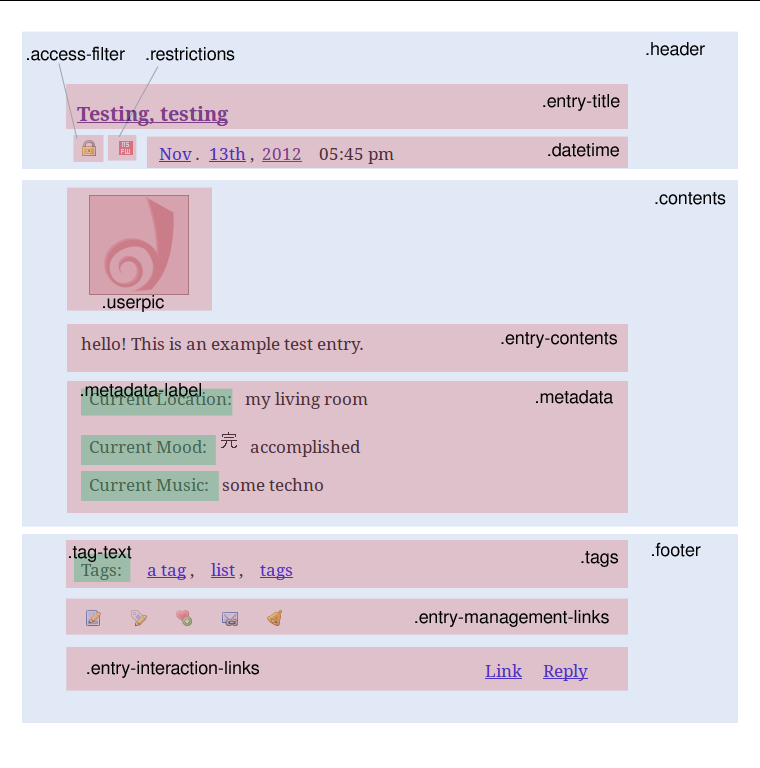
So most layouts use the core2 functions and names for things, and rely on Tabula Rasa to provide a bunch of standardized basic styling (Note: if you uncheck 'Use layout's stylesheet(s)', it will disable both TR's styling and the layout's secondary stylesheet). Let's have a look at some of those div names to give you an idea of how things get laid out. We'll start with an entry - every entry is wrapped in a div with a main class called .entry-wrapper, along with a bunch of other classes like what journal type it is, what security level the post is, who posted it, etc. Within that, there's a .seperator that comes before (with the secondary name of .secondary-before), the main .entry, and another .sperator (secondary name of .secondary-after). Within .entry - well, a diagram is probably easier than writing it out. These are the major ones:

There are, of course, more than just that. One of the great things about core2 is that everything is labeled extensively, which means CSS styling is easy. Comments are also very similar to entries, though they use .comment everywhere instead, and the .comment-wrapper carries information about thread depth and whatnot.
The other substructure you're likely to want to style are modules. Each module carries the class .module, along with a class specific to the module that looks like .module-nameofmodule. Inside this is .module-header, which has the title of the module in it, and .module-content, which has the rest of the stuff in the module. Other classes will vary wildly depending on which module it is.
If you want the full gory details of all possible div classes, they're mostly listed here. There's a lot, but remember that you don't have to use all of them - styling a higher level container works just as well a lot of the time.
If you're just writing custom CSS, that's it! Go forth and make beautiful things. If you're interested in submitting to![[profile]](https://www.momiji.dreamwidth.dev/img/silk/identity/user.png) dreamscapes so your layout can be all official-like, there's a few more things to keep in mind. The first is that official layouts can't be fixed-width. If you're using fixed-width to deal shifting elements around via negative margins, look up box-sizing: border-box - it means that padding and margins make the useable content area of the div shrink, rather than making the overall div grow bigger by the width of the padding and margins. The second is that it's really nice and helpful if you include things like title and module styling - we don't hide any of those, so at some point, they need styling. Also, it's best if your CSS works on Tabula Rasa - try it without disabling the TR stylesheet. TR makes doing updates and adding new elements really easy, so most of our layouts are descendants of it.
dreamscapes so your layout can be all official-like, there's a few more things to keep in mind. The first is that official layouts can't be fixed-width. If you're using fixed-width to deal shifting elements around via negative margins, look up box-sizing: border-box - it means that padding and margins make the useable content area of the div shrink, rather than making the overall div grow bigger by the width of the padding and margins. The second is that it's really nice and helpful if you include things like title and module styling - we don't hide any of those, so at some point, they need styling. Also, it's best if your CSS works on Tabula Rasa - try it without disabling the TR stylesheet. TR makes doing updates and adding new elements really easy, so most of our layouts are descendants of it.
Structurally, DW layouts are very different from LJ layouts because of one major thing: core2. core2 has a whole pile of functions that define how parts of the page print out, and they're very well-written, so most of the layouts use core2's functions instead of defining their own, while a lot of LJ layouts defined their own. This means most DW layouts have the same order for how elements print. DW layouts are also ALL DIVS ALL THE TIME, because it's easier to stretch and mold, and better for accessibility. If you're used to coding for Flexible Squares, you will probably find this somewhat familiar. Sorry, people who liked Smooth Sailing. The short list of layouts that have non-standard structures are:
-Abstractia
-Drifting
-Negatives
-Zesty
Note that Zesty is weird and special and I don't recommend trying to work with it unless you hate yourself. Some day we will bring it into line, but for now we're not going to talk about Zesty again.
Some layouts redefine their overall page structure, but keep the standard entry/comment/sidebar structure. There's a good visual guide to how the different layouts name and layout their big structures is here. Any layout other than Abstractia not listed on that page is a descendant of Tabula Rasa, and will have it's structure.
Which brings me to the second way in which DW layouts are different than LJ layouts, and that is Tabula Rasa. TR (abbreviations are faster, okay) exists as a layout in it's own right, and you can look it up and apply it to your journal. But if you do, you'll probably notice it doesn't look super-fancy or anything. This is because TR is sort of a proto-layout. It provides a whole pile of basic CSS styling things which are handy, because it means that other layouts don't have to worry about all that stuff. The biggest part of this is that it provides links between variables and the CSS elements they're supposed to be coloring.
Variables are basically named things who's value can change. So if I have a variable named $color, I can tell the CSS that an element should use $color as it's background color. And then somewhere else, I can say that $color is black, or white, or orange, and I never have to change the CSS itself. Most of the variables layouts use are things people can set in the customize menu - colors, fonts, font-sizes, if the user icon should be on the left or the right, fun things like that. There's a big list of all the standard color and font variable names here. A lot of layouts will define extra ones in addition to these for styling more stuff.
So most layouts use the core2 functions and names for things, and rely on Tabula Rasa to provide a bunch of standardized basic styling (Note: if you uncheck 'Use layout's stylesheet(s)', it will disable both TR's styling and the layout's secondary stylesheet). Let's have a look at some of those div names to give you an idea of how things get laid out. We'll start with an entry - every entry is wrapped in a div with a main class called .entry-wrapper, along with a bunch of other classes like what journal type it is, what security level the post is, who posted it, etc. Within that, there's a .seperator that comes before (with the secondary name of .secondary-before), the main .entry, and another .sperator (secondary name of .secondary-after). Within .entry - well, a diagram is probably easier than writing it out. These are the major ones:

There are, of course, more than just that. One of the great things about core2 is that everything is labeled extensively, which means CSS styling is easy. Comments are also very similar to entries, though they use .comment everywhere instead, and the .comment-wrapper carries information about thread depth and whatnot.
The other substructure you're likely to want to style are modules. Each module carries the class .module, along with a class specific to the module that looks like .module-nameofmodule. Inside this is .module-header, which has the title of the module in it, and .module-content, which has the rest of the stuff in the module. Other classes will vary wildly depending on which module it is.
If you want the full gory details of all possible div classes, they're mostly listed here. There's a lot, but remember that you don't have to use all of them - styling a higher level container works just as well a lot of the time.
If you're just writing custom CSS, that's it! Go forth and make beautiful things. If you're interested in submitting to
